Transforming B2B Financial Platform
Trust Payments' legacy portal MyST (My Secure Terminal) managed billions in annual transactions but was struggling to meet modern fintech demands. Partners used it daily for merchant management and transaction processing, but its outdated interface was hindering efficiency.
UX Reasearcher, UI/UX Designers
UX revamp metrics, User Research, Visual Designs
Over 7 months
Challenge
Performance: 40+ second delays for data access
Support Volume: 2,000+ monthly support tickets
Time Waste: Partners spending 5-6 hours weekly on manual tasks
Growth Barriers: Limited self-service capabilities
Results
Task completion: 40s → 12s (70% faster)
Support tickets: 2,000+ → 800 monthly (60% reduction)
Export success: 95% reliability
Manual work: Eliminated 5-6 hours weekly per partner
70%
Task Completion Time Improved
60%
Reduction in Support Tickets
95%
Data Export Success Rate
Finding Top Tasks
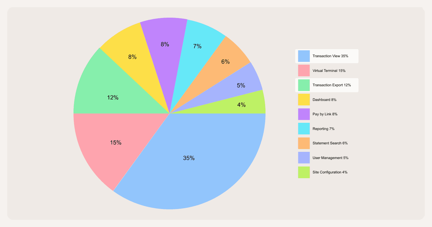
A workshop with 12 participants (partners, stakeholders, and internal users) revealed three critical tasks:
Transactions (35% priority)
Managing transaction data
Running reports
Filtering results
Virtual Payments
Processing payments
Payment status tracking
Transaction Exports
Downloading data
Generating reports
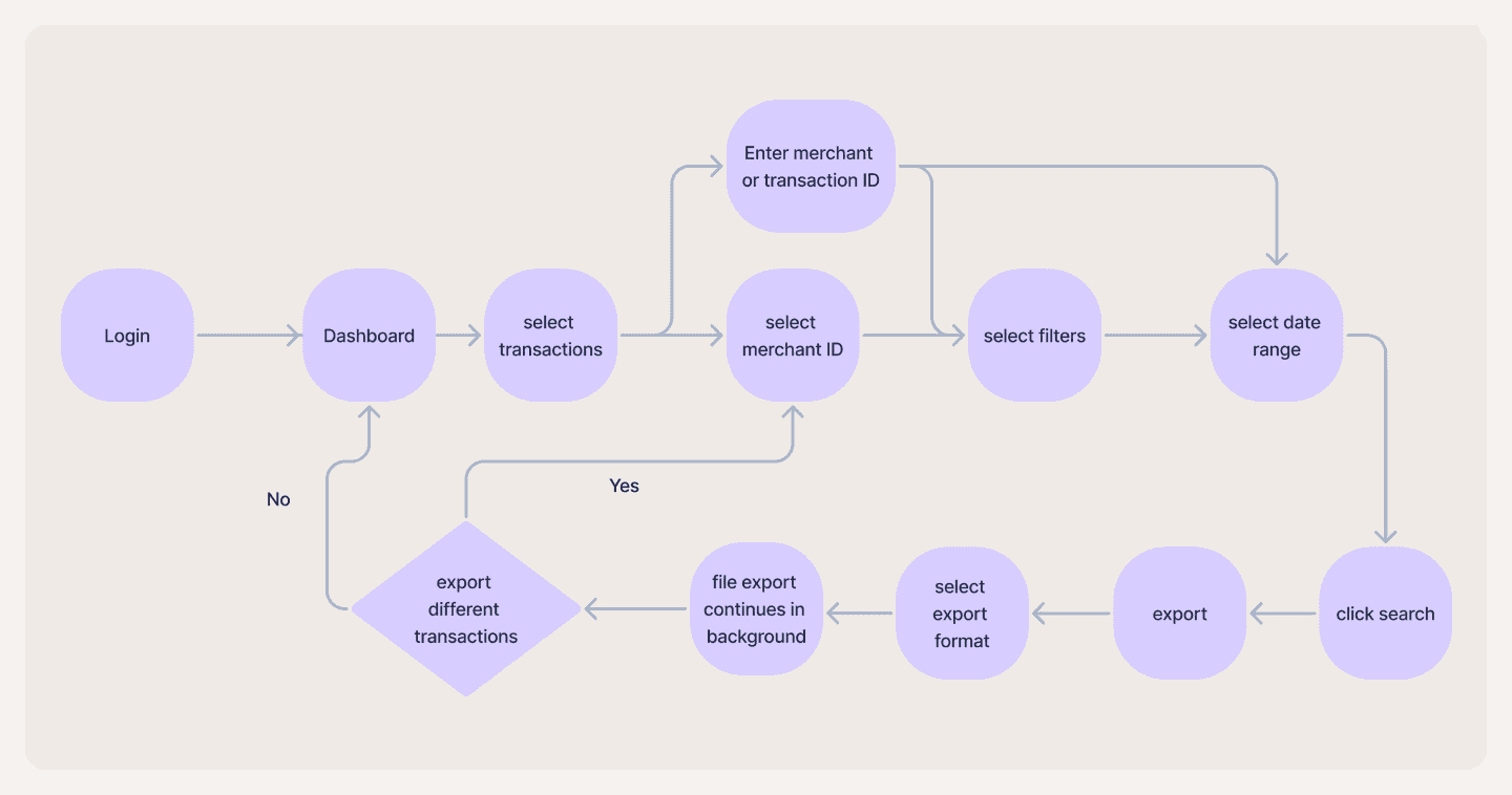
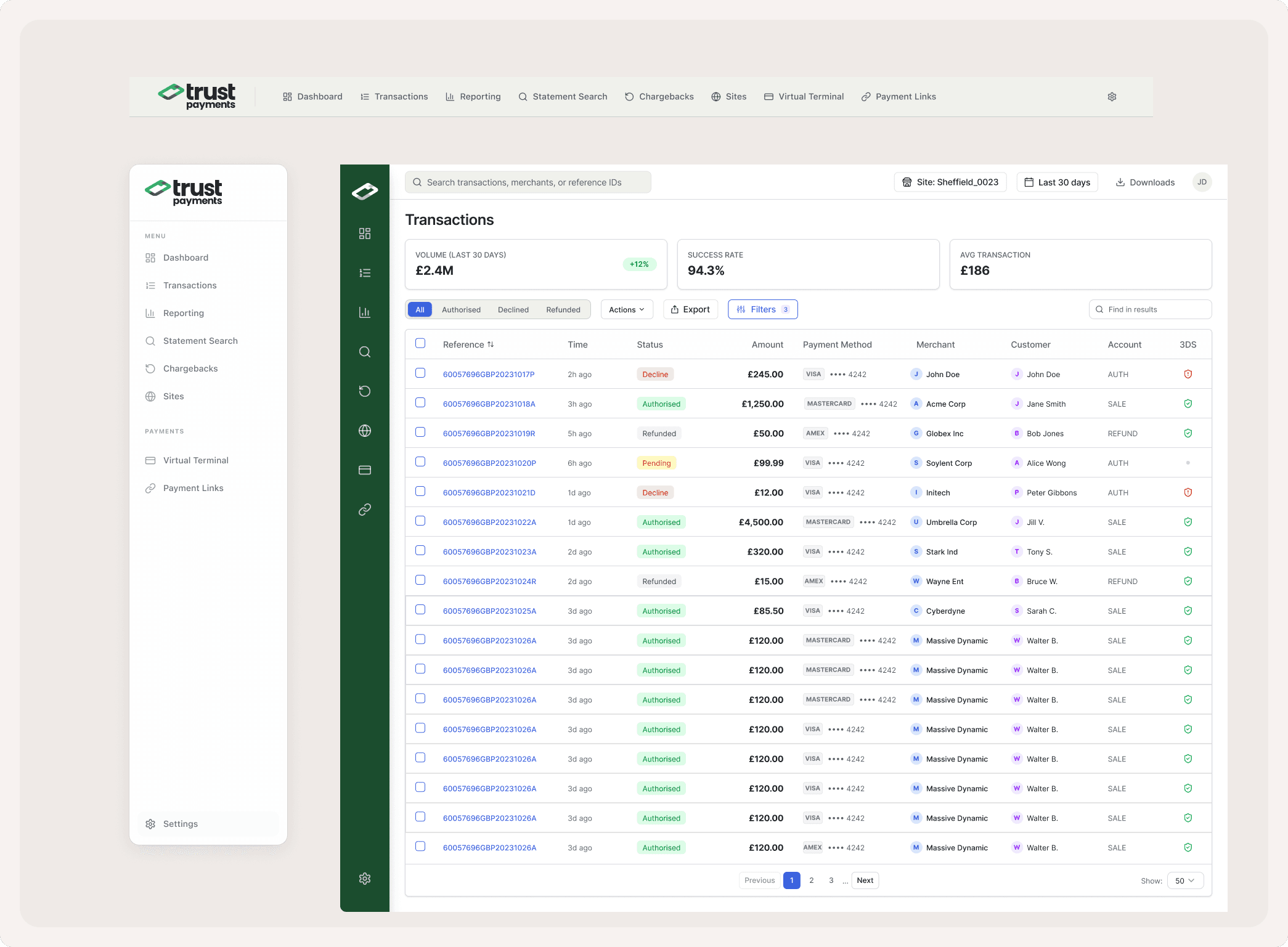
This analysis helped prioritize the transaction management system as our primary focus for redesign, specifically the filtering and export capabilities.
Usability Study & User Interview
Focusing deep into the transaction top task, a usability run of the existing transaction user journey was done with internal users to gather insights and creating assumptions. Which were collected into a journey map to showcase how the whole experience of exporting transactions was for the users.
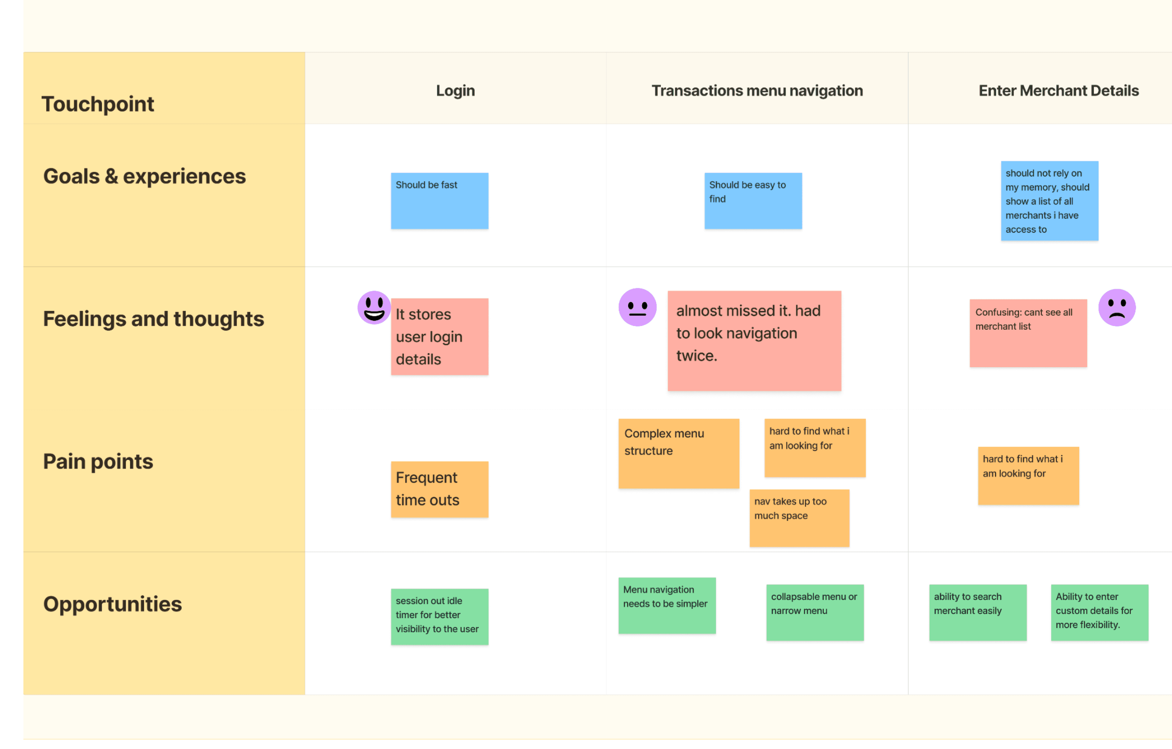
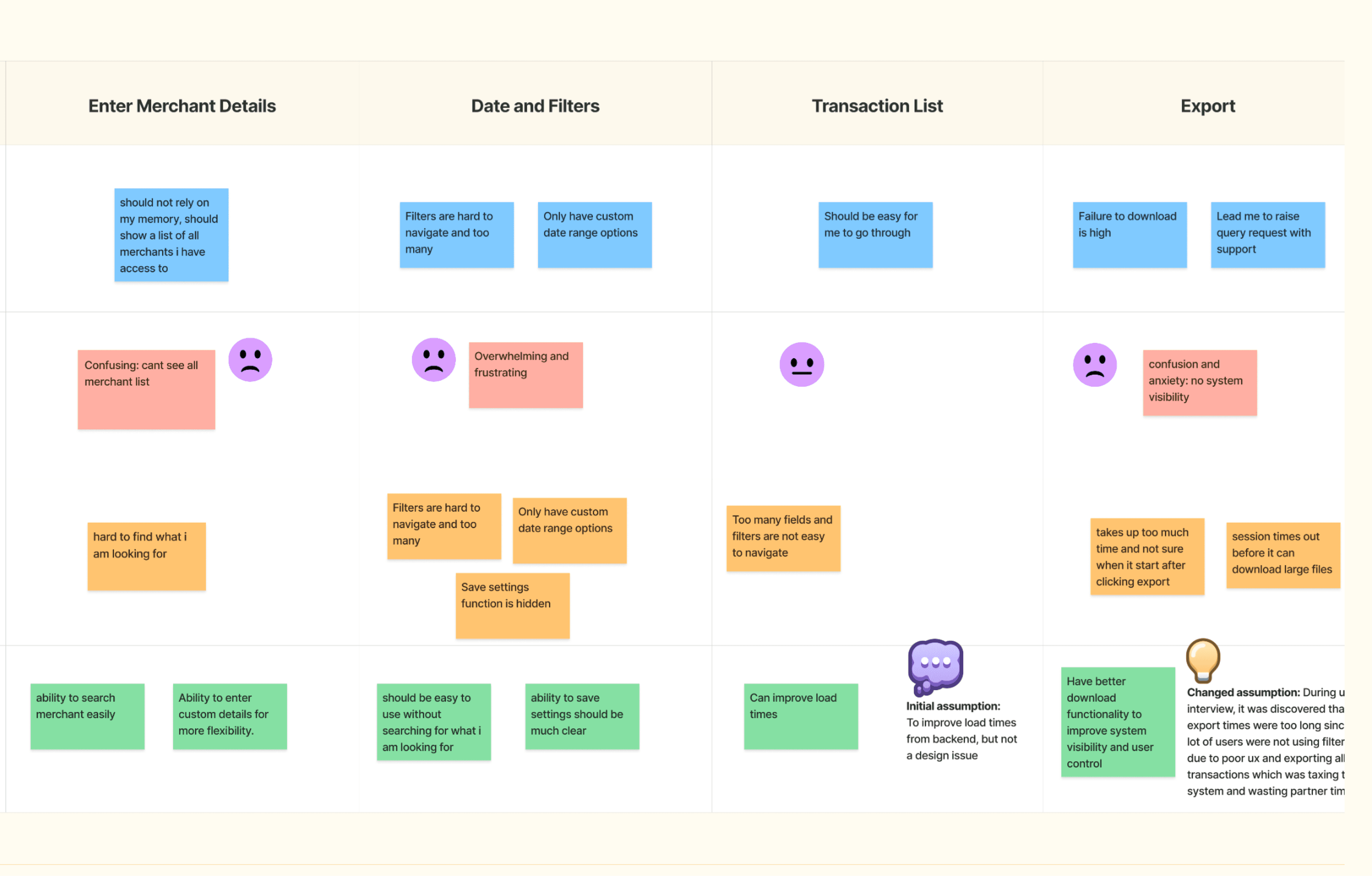
Journey Map
The whole experience of the usability study was mapped in a user journey to look at the overall experience.
Pain Points
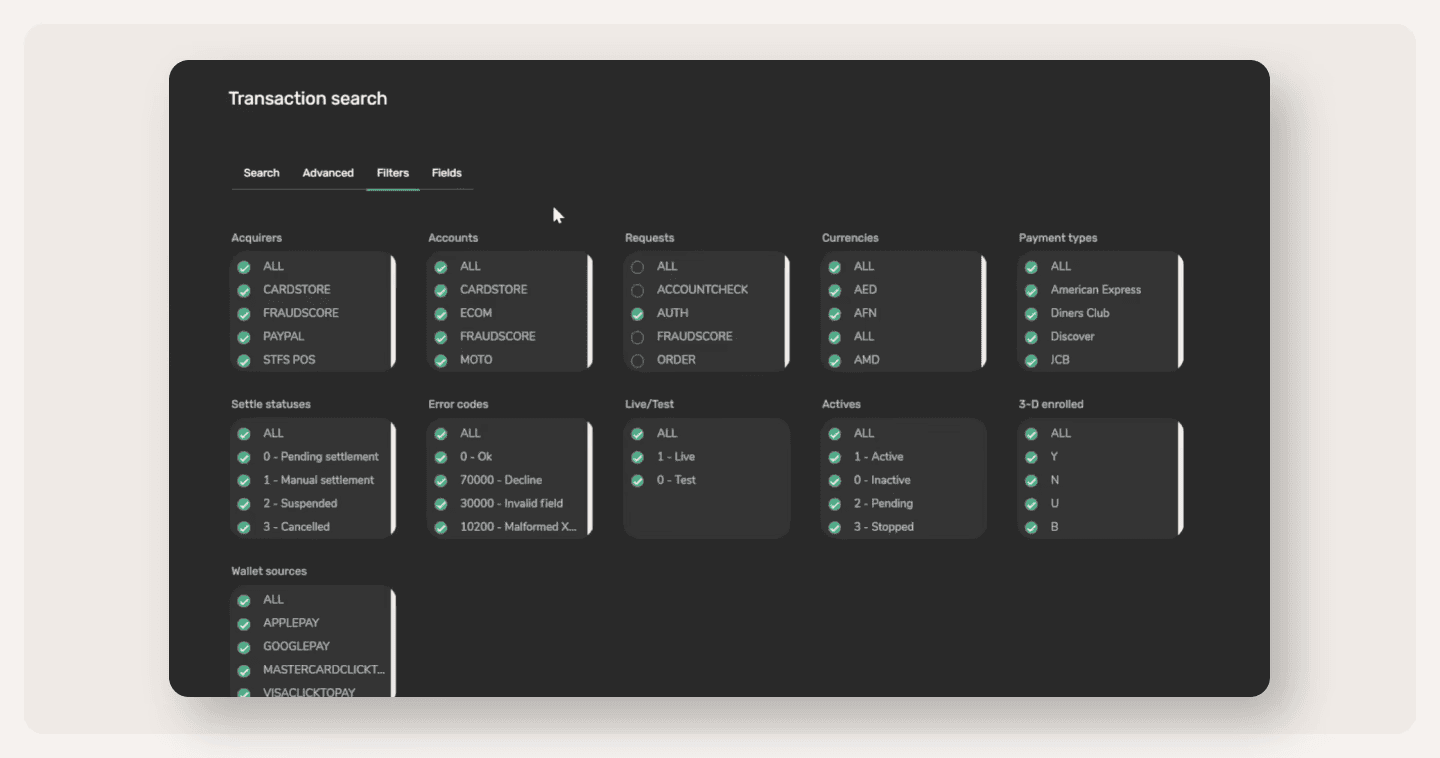
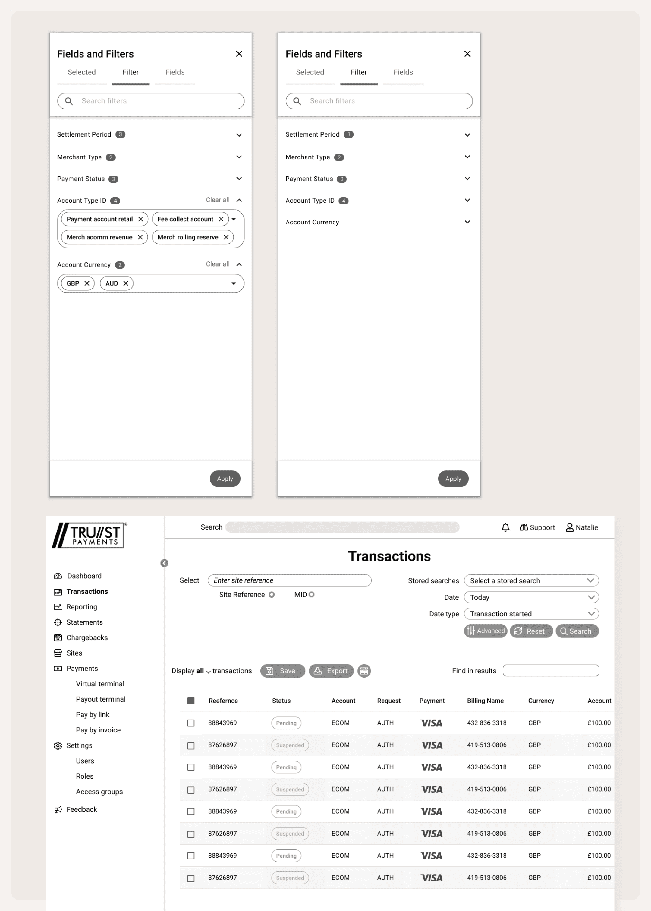
Complex filters leading to user avoidance
Hidden frequent tasks and inefficient navigation space
Unreliable export system causing support dependency
"I just export the whole data in excel, instead of messing with filters. The system (filter selection) is way too complicated to find and select."
-Merchant
Assumption vs Reality
Initial Assumption:
Slow performance was causing transactions to be exported
Key Finding:
Partners avoided filters due to complex UI, and poor discoverability.
Users exported entire lists for manual Excel filtering.
Root cause: Poor filter UX, not backend performance.
Design Solution
Improving data accuracy by having different ways to access merchants.
Streamlining the transaction return and export flow.
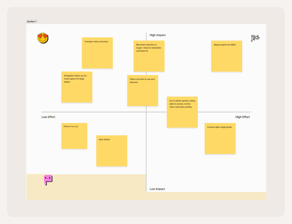
Problem Prioritisation
Cross-functional workshop with Product Manager, Engineering Lead, and Support Team Lead to map issues on Impact vs. Effort matrix.
Quick wins identified → navigation and filter improvements prioritized for immediate development, with high-effort features planned for phased delivery.
This focused approach helped create realistic timelines and ensure stakeholder alignment.
Success Metrics
To measure the impact of the solution on the final partner experience and business. Some success metrics were defined. Here are some success metrics defined before the redesign:
Task completion time.
Data export success rate.
Support query generation rate.
Overall partner satisfaction (qualitative).
Feature usage rate.
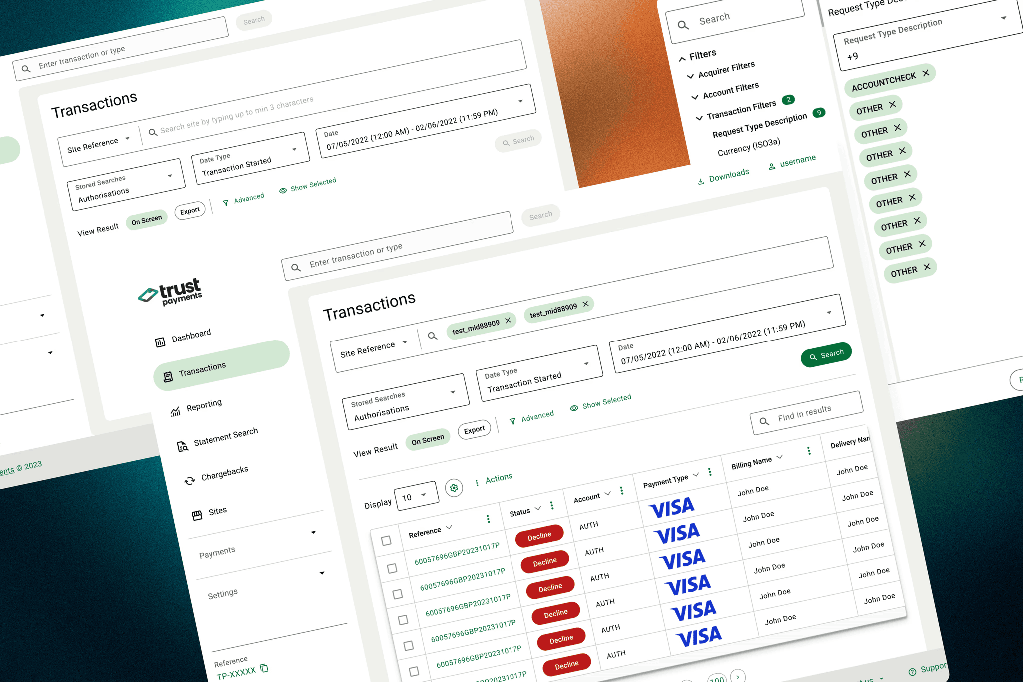
Wireframes
Problem 1
Problem: Complex menu structure limiting self-service
Navigation redesign
Better interaction with the table. To give user more space to view larger tables.
Simple navigation structure: By keeping most used features upfront and using sub-menu for items which are less frequently used.
Problem 2
Users wasting 5-6 hours on manual filtering of exports.
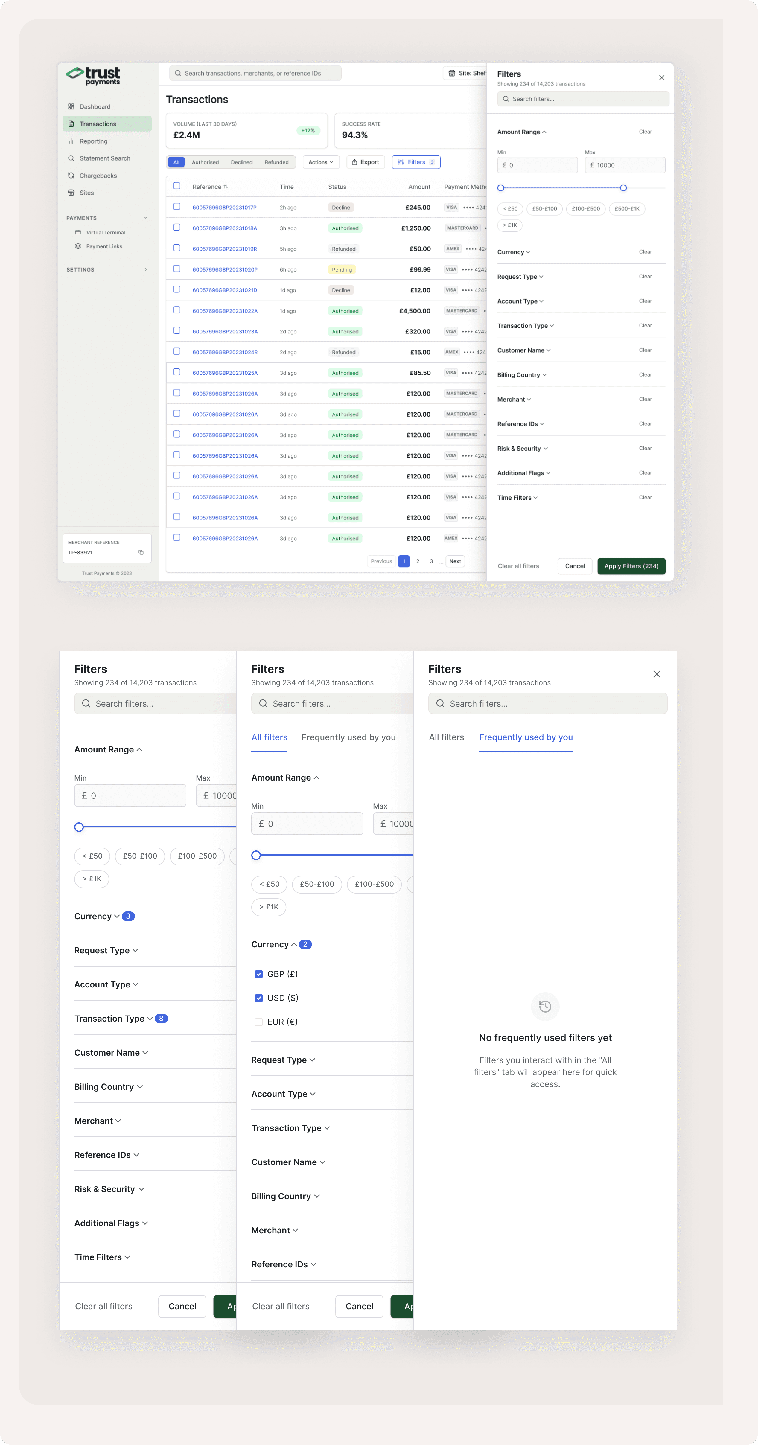
Filter Redesign
Search within filters — Partners managing 15+ filter categories can now type to find the right filter instantly instead of scrolling.
Quick-select chips for amount ranges (< £50, £50-£100, £100-£500, £500-£1K, > £1K) replacing manual min/max entry.
"Frequently used by you" tab — The system learns which filters each partner uses most and surfaces them separately, reducing repeat setup time.
Active filter count badge (e.g., "Filters 3") visible on the main screen so partners always know what's applied.
Problem 3 & 4
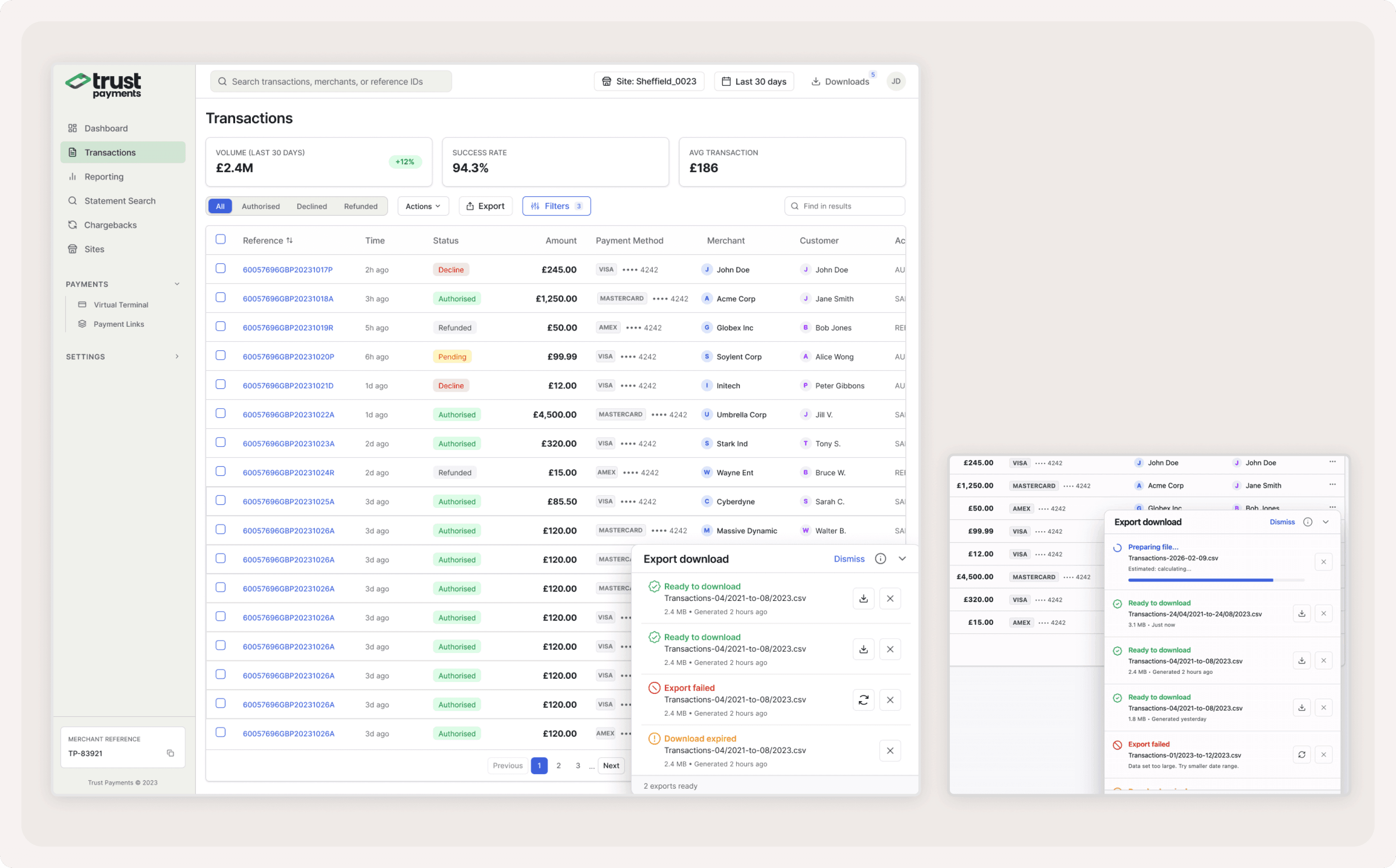
Problem 3: High export times due to poor performance.
Problem: 2,000+ monthly support tickets from export timeouts and session loss
Export redesign
Exports now prepare in the background — partners can continue working or even log out while the file generates.
Download manager panel shows real-time status: preparing, ready to download, failed, or expired — with file size and generation timestamp.
Failed exports show clear error reasons (e.g., "Data set too large. Try smaller date range.") with a retry button.
Downloads hub in the top navigation gives access to all past exports, not just the current session.
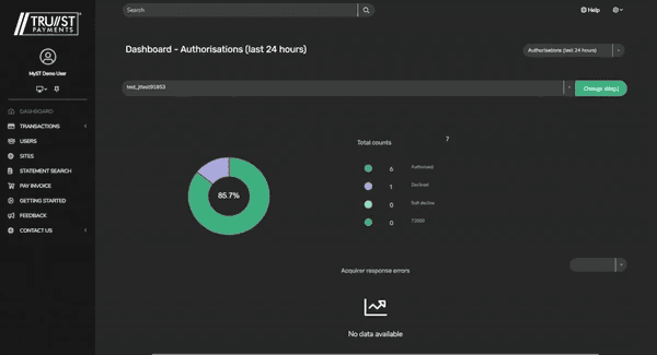
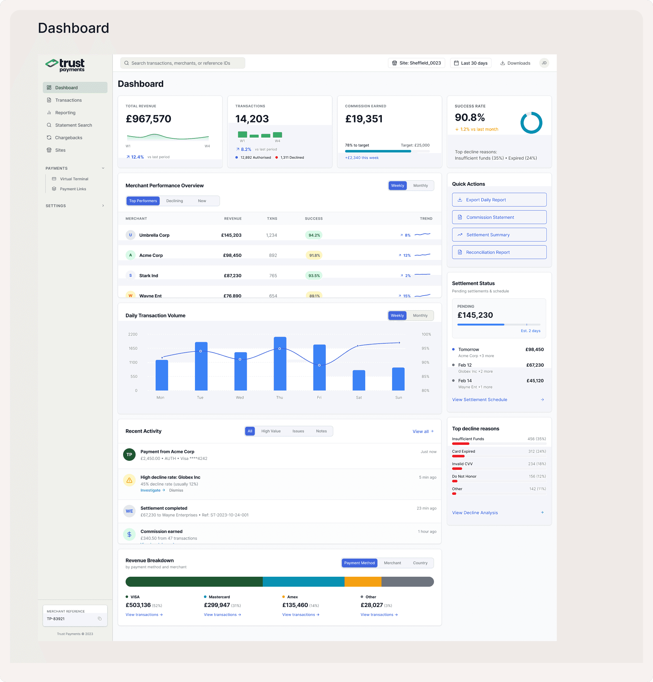
Redesign of Dashboard
No unified view — Partners had to visit 4+ screens to understand daily business health
The legacy portal had no dashboard. Partners started their day on the Transactions page and manually pieced together performance data across Reporting, Statements, and Chargebacks.
KPI cards — Total Revenue, Transaction Count, Commission Earned, and Success Rate with trend indicators and period comparisons at a glance.
Merchant Performance table — Top/Declining/New merchants with revenue, transaction count, success rate, and trend sparklines. Filterable by weekly/monthly.
Daily Transaction Volume chart — Combined bar + line chart showing volume and success rate correlation, helping partners spot anomalies instantly.
Quick Actions panel — One-click access to Export Daily Report, Commission Statement, Settlement Summary, and Reconciliation Report — the 4 most-requested actions from support data.
Settlement Status — Pending amount with estimated clearing dates, directly addressing the balance discrepancy pain point.
Top Decline Reasons — Breakdown showing Insufficient Funds, Card Expired, Invalid CVV with counts, enabling proactive merchant support.
Revenue Breakdown — Segmented by Payment Method, Merchant, and Country for portfolio-level insight.
Recent Activity feed — Real-time alerts for high-value payments, anomalous decline rates, completed settlements, and earned commissions.
Result & Impact
Task completion: 40s → 12s (70% faster)
Support tickets: 2,000+ → 800 monthly (60% reduction)
Export success: 95% reliability
Manual work: Eliminated 5-6 hours weekly per partner
Key Lessons:
Assumption vs Reality
Initial focus on performance was misplaced
User behaviour revealed UX as core issue
Simple solutions often outperform technical fixes
Research Impact
User quotes revealed critical insights
Journey mapping exposed hidden pain points
Cross-functional workshops enabled better prioritization
Design Process
Start with user pain points, not technical assumptions
Prioritize high-impact, low-effort solutions
Test solutions with real users early
Next Steps
Apply successful patterns to other features
Continue monitoring via Heap Analytics
Regular feedback collection from partners